Burger King – Fresh?

Burger King and Mess Marketing recently opened an Art Gallery/Event Space/Think Tank/Hipster artist collective in Chicago dubbed Burger King Studio. The concept is kind of interesting; you can mingle with artists at the occasional event and buy and customize t-shirts on the site. All-in-all, a great fit for BK’s well-known “have it your way” brand position, but there are some pieces of this campaign that have drawn a little too much inspiration from the creative community they’re aping.

Figure 1 – Inspiration?

This is a shot Burger King Studio’s Store side-by-side with Threadless.com — note the similarities in the presentation of the t-shirts, the use of hipster models and solicitations to participate/create your own shirts. Despite the similarities, I could give BK a pass on this one as more of an “inspired by” than a rip-off.

Figure 2 – Rrrrrrrip

Unlike the Figure 1, this example is a 100% rip-off of a classic design created by Experimental Jetset. In fact, this design has been ripped so many times that Experimental Jetset has a section of their site dedicated to cataloging the infractions.

Not only is the t-shirt unoriginal, it kind of made me think of the old McDonalds Big Mac jingle. You know, the one where they sing the ingredients…

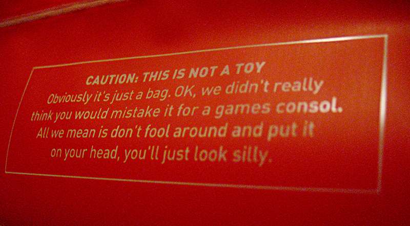
Figure 3 – mixed messages

The jingle is about 15 seconds in…


What do you think? Should they get an “A” for going through the effort of trying something new in a well-trod space or is this simply another clumsy corporate co-opting of creative culture?

Of Interest – May 8

Information Design Patterns – a nice collection of common information design approaches; includes detailed descriptions, usage and examples.

QR codes are paving a way to share and hide media – I don’t think QR codes have really caught on in the States, but I think they offer a lot of potential for unobtrusive mobile/real-world advertising.

Best ATM Interface Yet – a nice write-up of the new Wells Fargo ATM interface — with pictures!

Brightkite – I’ve been using brightkite for a few weeks now; I’m still trying to get a handle on the possibilities it offers — I’d like to see location-enabled integration with Yelp, Upcoming and other local-centric services and advertising. I think it could really take off with GPS-enabled phones and/or automated updates. If you’re looking for an invite, hit me up on twitter or e-mail.

Speaking of twitter, Is JetBlue using twitter to spy on its customers…or blow their minds? is a good read — describing one guy’s personalized big brother-type experience with a notable brand. I can envision a day when this approach becomes unmanageable for big companies (like when the lawyers get involved). For now, it’s really exciting to see this kind of interaction with customers.

Link Dump

Lots of good stuff out on the ol’ interwebs this week. In no particular order:

The Orange Underground – an interesting campaign for Cheetos by Goodby Silverstein. There are a lot of nice little touches, like the pattern overlaying the video and the cheap “paper” and felt-tip pen drawings in the cookbook.

Exiled!, a new show from MTV. Take the Super Sweet 16 kids and send them to live with tribes in Africa and Antartica. It sounds like a joke, but the Fallon Planning Blog has the skinny.

Guinness, Life of a Dot, a nice progression of their award-winning Evolution spot. I think these pieces complement each other nicely without trying to rehash the exact same idea.

CP+B’s Holiday Card – made for a select group of their clients, this card features a nice little customizable video and some surprising interaction at the end. (Use this code: 547WERT)

More on the CP+B tip, they’re doing some nice work for Domino’s now; taking them back to their “30 minutes or it’s free” guarantee.

Cool Flash-based website for Soïa & Kyo, a fashion outerwear maker. Love the 3D space mixed with the hand-drawn elements.

Puma’s Wit & Wisdom

I finally made it to the new Puma store at my local mall to grab a fresh pair of kicks and when I got them home I was pleasantly surprised to find this clever message on the bottom of my shopping bag:

Puma’s shopping bag - click to enlarge

It reads:
“CAUTION: THIS IS NOT A TOY. Obviously, it’s just a bag. OK, we didn’t really think you would mistake it for a games consol. [sic] All we mean is don’t fool around and put it on your head, you’ll just look silly.”

It’s always fun to find little bits of unexpected humor in seemingly mundane places… kudos to the copywriter! Shame on the proofreader though… unless there’s an alternate spelling for “console” that I’m not aware of.

F*** you, Bob

Normally I don’t care for Budweiser commercials. They’re amusing, but they tend to stick to variations on a single joke. This one, however, features swearing — and that’s almost always funny.

D’s nuts

I was reading a little about Delta’s new logo today and I happened across the Delta Museum’s logo timeline and found this explanation of their newest mark:

delta's blowing smoke
logo by Lippincott

Now, I like the new look, but that whole statement is nuts. I may buy wine based on the label, but a logo by itself is going to convince me that any company is “highly differentiated” and “customer-focused” — especially when I’ve been a disappointed customer. Delayed flights, indifferent employees, unusually cramped seats, old planes… these are the areas to fix and differentiate yourself to prove you’ve changed.

They’ve created a nice website to show they’re trying, but it’s going to be difficult to shake their crummy reputation.

There’s more great discussion about the logo itself over at Speak Up’s Brand New.