There’s a new soon-to-be-overused web design technique making its way across the internets. I don’t know if it has a name yet, so I’ll dub it… subtle suede. (Sandpaper would have worked too, but it doesn’t sound as sexy.) I first used it on a work project, then this blog, but I think the technique received its widest acclaim thanks to Blue Flavor’s tasty Leaflets site.
It super easy to create… all you need is Photoshop and a few minutes to kill. Here’s the how-to:
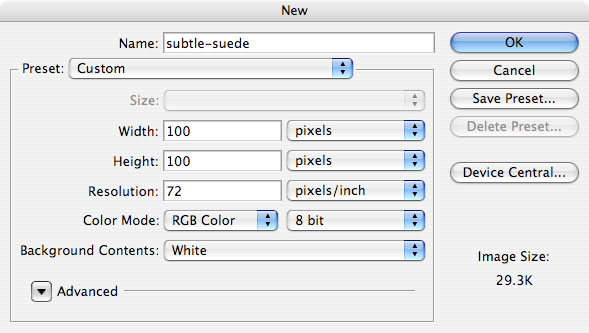
1. Create your canvas. This texture repeats fairly seamlessly, so size doesn’t matter. I’ve selected 100×100 to make things easy to see here.
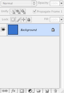
2. Fill your background layer with your favorite color.
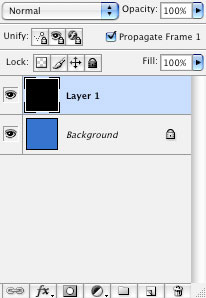
3. Add a new layer and fill that with any ol’ color.
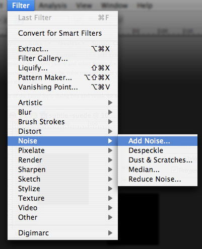
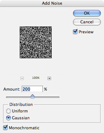
4. With your new layer highlighted, make some noise. Go to Filter > Noise > Add Noise…
5. Leave Monochromatic checked, then tweak the Amount and Distribution values to your liking. My favorite values are picture here.
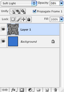
6. Time to make it subtle… set your blend mode to Soft Light and crank the opacity way down. I usually set mine to 8% — anything over 15% and the subtlety is lost.
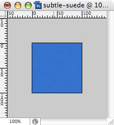
7. Done. If you’re using this for a background, add it to your stylesheet and repeat appropriately. See the finished result here and here.
Glass, plastic, suede. Can’t wait for the “polyester” (a.k.a. the Deney Terrio) craze to hit.