I was reading a little about Delta’s new logo today and I happened across the Delta Museum’s logo timeline and found this explanation of their newest mark:
logo by Lippincott
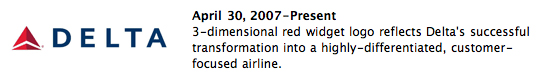
Now, I like the new look, but that whole statement is nuts. I may buy wine based on the label, but a logo by itself is going to convince me that any company is “highly differentiated” and “customer-focused” — especially when I’ve been a disappointed customer. Delayed flights, indifferent employees, unusually cramped seats, old planes… these are the areas to fix and differentiate yourself to prove you’ve changed.
They’ve created a nice website to show they’re trying, but it’s going to be difficult to shake their crummy reputation.
There’s more great discussion about the logo itself over at Speak Up’s Brand New.