The latest issue of Step Inside Design featuring the 2008’s Best of the Web should be on a newsstand near you now. After reading the issue and looking through their picks, I came away feeling disappointed that they’ve picked these 43 websites as the very best the web has to offer.
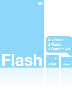
Of the winning selections, 28 are completely Flash-based sites, only eight are HTML-based (some of those are hybrid HTML/Flash sites), four are videos (including a PowerPoint posted to YouTube), two are reels and there’s one lonely banner.


I’ve created a little infographic (above) illustrating the relative number of entries for each category… and I have to ask again; does this really reflect the very best content the web has to offer? Judging purely on eye candy (aka function following form), maybe…. although a scan through the FWA will reveal many more worthy candidates. Thinking about it from the perspective of the sites you might visit for more than a few minutes and actually use on a daily basis, definitely not. And don’t get me started on including reels and videos as examples of good web design… did they get their entry forms confused?
There are so many sites that take complex data and interactions and boil them down to easy to use, elegantly designed interfaces—sites that don’t require pokey preloaders, “skip intro” and “enter site” links and “innovative” navigation schemes—sites like Evernote, Vimeo, the ubiquitous Twitter, Tumblr, and many, many more.
I know the judges are working with what they’re given, so it’s hard to knock them. Still, I’d like to see a better cross-section of the web in the future. Is it just me?
If you want to judge for yourself, here’s a list of all the winners:
Judge’s picks:
www.thinkaboutit.com (It looks like the domain registration has lapsed on this one), www.digitalvaults.org, www.hornallanderson.com
Flash:
www.adobe.com/creativelicense, www.anode.com, www.antics.com, http://bbbf.archrival.com, www.torkrevolution.com, www.290mulberry.com/#/Nolita, www.hbovoyeur.com, www.luminafoundation.org/latinos, www.mofo.com/career, www.ebd.com, www.shearsadkins.com, www.eyeballnyc.com, www.166perryst.com, www.ftc.gov/bcp/edu/multimedia/interactive/infosecurity/index, www.bakemaniacakes.com, www.1201k.com, www.HL2.com, www.nsfclothing.com, www.virginfestival.com/2007/btb_sampler/pre/, www.cuspconference.com/2008, www.d4wgear.com/bc/d4w/index.html, www.groundinc.com, www.ge.com/innovation/nano, www.ge.com/innovation/aviation, www.cat.com/cda/layout?m=8703&x=7&f=177263
HTML:
www.aigadc.org/showoff, www.gallup.com, www.pbs.org/kcet/wiredscience, www.sciarc.edu, www.vulcanmotorclub.com, www.earthpledge.org, www.alaska.si.edu, www.poetryfoundation.org
Video:
www.antics.com/awards/Best_of_Web_2008/AMD/index.html, http://langtoncherubino.com/blog/2008/02/25/53/, www.nicespots.com/nicespots/webReels/index.php?webReelID=578&webReelShareEmailID=88&webReelShareID=1172, www.nicespots.com/shortURL.php?id=103018
Reel:
www.firebellydesign.com/animation_reel2007.php, www.hzdg.com
Banner:
www.client.struckcreative.com/skiUtah/banners/oldMan/index.html


