SXSWi recap, Day Two

Jason Santa Maria and Rob Weycert at SXSWi 2008

Day two of SXSWi started with Jason Santa Maria’s and Rob Weychert’s panel, Everyone’s a Design Critic (slides). Given that it was (a) first panel of the day following the opening night parties and (b) the biggest room in the convention center, there were empty seats and bleary eyes to spare. Rob and JSM took it in stride and did a fantastic job of warming up the crowd by getting everyone to cheer and jeer several popular sites. Once everyone was wound up, they whipped out some real world examples and explained how to:

Continue reading “SXSWi recap, Day Two”

Photoshop Express

Adobe just released Photoshop Express, their online Flash-based version of Photoshop (think Picnik). 2GB of free storage, galleries and photo editing (including color correction, red eye removal, effects and more). After a quick test drive, I’m impressed.

Sidebar: also pleasantly surprised they’re offering a test drive without the need to create an account—a la sign up forms must die.

I’m curious to see how this will evolve, specifically integration with other sites—they call out blogs and Facebook, but the ability to integrate with Flickr and other photo sharing sites (via API or otherwise) would be a nice touch.

Random Internet Awesomeness

I’m fine-tuning my remaining SXSWi wrap-up posts (I’m planning to post them later this week).

In the meantime, enjoy the random internet awesomeness that’s caught my attention as of late:

The 960 Grid System; similar to my favorite CSS framework, Blueprint CSS. I haven’t tried it yet, so I can’t say how it’s any better or worse.

A while back, Microsoft signed up with CP+B to the tune of $300 million; it seems the fruits of CP+B’s creative efforts are beginning to bloom. Part warm-and-fuzzy, part jackass (although not necessarily at the same time.)

Noted for (mostly for my) future CSS reference: using Opacity vs RGBA.

Every episode of South Park, ever. Nice. Similar to The Daily Show’s extensive archive.

Squirrels network like Facebook friends – not that they’ve mastered computers or anything, but it’s probably just a matter of time.

AnimalHavenKC.org redesign

Redesigned Animal Haven homepageI am happy to announce the recent launch of a new website for Animal Haven, a fantastic Kansas City-area animal shelter. Animal Haven’s mission is to provide a higher quality of life for homeless pets through adoption, education and collaboration with the animal welfare community. They’ve been around since 1968, working hard to place homeless pets in good homes.

Old Animal Haven homepage A friend of mine connected me with the staff at Animal Haven a few months ago. At the time, they had a website that was hard to maintain, difficult to navigate and not focused on their goal: adoptions. After talking with the staff and learning where they wanted to take the organization and the website, I was able to design a site that better addressed their audience and their mission.

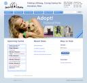
The homepage was revamped to prominently feature adoptions; random photos of their adoptable pets (courtesy of PetFinder.com) are immediately visible, and visitors can view all of Animal Haven’s adoptable pets without leaving the site. I integrated tools they were already using, like Google Calendar for events and Google Checkout for donations. Thanks to the new content management system, they can easily manage the site and incorporate content from YouTube and PhotoBucket. Last but not least, I added a blog to help them share their success stories, shelter news, event information and more.

I’m really happy with the results; special thanks to the staff at Animal Haven for all of their input and effort. If you’re in the Kansas City area and you’d like to adopt a pet, AnimalHavenKC.org is the place to go.

Results:
Since launching the site two weeks ago, overall visits have increased 38.5%. Pageviews have increased 180%. The bounce rate has dropped over 72% — from 66% to 18%, the average time spent on the site has increased 144%, and blog subscriptions have been increasing every day.

Link Dump

Lots of good stuff out on the ol’ interwebs this week. In no particular order:

The Orange Underground – an interesting campaign for Cheetos by Goodby Silverstein. There are a lot of nice little touches, like the pattern overlaying the video and the cheap “paper” and felt-tip pen drawings in the cookbook.

Exiled!, a new show from MTV. Take the Super Sweet 16 kids and send them to live with tribes in Africa and Antartica. It sounds like a joke, but the Fallon Planning Blog has the skinny.

Guinness, Life of a Dot, a nice progression of their award-winning Evolution spot. I think these pieces complement each other nicely without trying to rehash the exact same idea.

CP+B’s Holiday Card – made for a select group of their clients, this card features a nice little customizable video and some surprising interaction at the end. (Use this code: 547WERT)

More on the CP+B tip, they’re doing some nice work for Domino’s now; taking them back to their “30 minutes or it’s free” guarantee.

Cool Flash-based website for Soïa & Kyo, a fashion outerwear maker. Love the 3D space mixed with the hand-drawn elements.