Staying Creative

I recently started a group for Creative Directors over on LinkedIn (the group is a precursor to yet-to-be unveiled project I’m developing) and I’ve been pleasantly surprised by the quality of the discussions. A recent discussion started with the question of how to maintain your creative spark when you’re pulled out of a creative environment and dealing with left-brained folks all day.

I won’t include anyone else’s comments (although they’re welcome to comment here), but here’s my $.02 on the subject (slightly modified from my original comment on LinkedIn):

1) I can’t picture a day when I’d want to step away from designing and the creative process. BUT the thing that’s constantly kicking my butt is the fact that I get pulled in so many different directions — meetings, emails, hallway meetings, mediation/counseling—the fun never ends. Don’t get me wrong, I truly enjoy what I do, but the trade-off is I can’t always give my projects as much attention as I’d like. I haven’t found (and don’t see) a design/management/leadership balance yet. 

2) The first (and best) piece of advice I received when I was starting my career in the design world was to ‘hire people better than you’. Coming from the guy who just hired me, that sounded like really smart advice. : ) It’s something that I’ve tried to do since I put on a hiring hat (7 years ago—time flies), and it’s served me well. To earlier point(s), it’s humbling to get your butt kicked by a creative dyamo, but the good part is I learn a lot in the process and it pushes me to do better work.

This is either a cautionary tale or good advice (I hope) for those looking to grow in their careers. What do you think? If you manage people, how do you maintain balance? If you’re a creative, how do keep your spark sparkin’?
Fennec – the little things

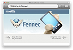
I downloaded a copy of Fennec today — Mozilla’s experimental mobile browser optimized for touch screen mobile devices.

If you’re either TK or one of the .00001% of the rest of the population who owns a Nokia N810, you can test the browser in a real mobile environment.

For the rest of us, Mozilla’s been kind enough to offer downloads of Fennec that work in Windows, OS X and Linux.

It’s actually pretty aggravating to use a touch screen-optimized browser with a mouse and keyboard, but I was happy to see the thought they’ve put into the user experience.

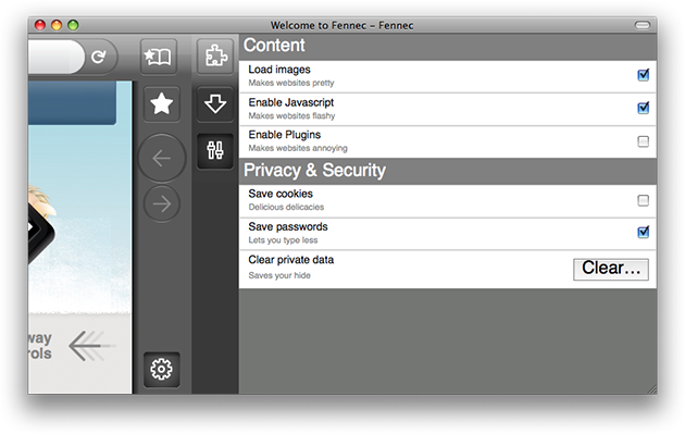
Case in point, the settings screen:

If you can’t read these, the items include gems like:
Load images – Makes websites pretty
Enable Javascript – Makes websites flashy
Enable Plugins – Makes websites annoying

At SXSWi ’08, there was a great panel called, “From Frustration to Elation” that made the case that injecting emotions (like humor, happiness, empathy, etc.) into products, software and services helps people make positive connections with the experience, which can contribute to the difference between a successful product and a failure.

In an arena with a growing number of players (like this, this and this), little things can have a big impact.

Joe the Plumber?

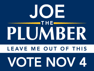
Continuing the recent thread of politically-themed design posts, I’ve created a campaign sign for Joe the Plumber, a new d-list celebrity introduced to the public by John McCain in the 3rd and final Presidential debate.

As with another recent post, I’m releasing this design with a Creative Commons license, so that anyone can grab the artwork and use it for any non-commercial endeavor (or at least come up with a cleverer slogan).

Vector (.ai), large jpeg

Creative Commons License
Licensed under a Creative Commons Attribution-Noncommercial-No Derivative Works 3.0 United States License.

For my fellow font nerds, the Obama-like font is Avenir, as I don’t have a copy of Gotham handy.

Of Interest – May 8

Information Design Patterns – a nice collection of common information design approaches; includes detailed descriptions, usage and examples.

QR codes are paving a way to share and hide media – I don’t think QR codes have really caught on in the States, but I think they offer a lot of potential for unobtrusive mobile/real-world advertising.

Best ATM Interface Yet – a nice write-up of the new Wells Fargo ATM interface — with pictures!

Brightkite – I’ve been using brightkite for a few weeks now; I’m still trying to get a handle on the possibilities it offers — I’d like to see location-enabled integration with Yelp, Upcoming and other local-centric services and advertising. I think it could really take off with GPS-enabled phones and/or automated updates. If you’re looking for an invite, hit me up on twitter or e-mail.

Speaking of twitter, Is JetBlue using twitter to spy on its customers…or blow their minds? is a good read — describing one guy’s personalized big brother-type experience with a notable brand. I can envision a day when this approach becomes unmanageable for big companies (like when the lawyers get involved). For now, it’s really exciting to see this kind of interaction with customers.

AnimalHavenKC.org redesign

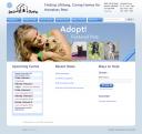
Redesigned Animal Haven homepageI am happy to announce the recent launch of a new website for Animal Haven, a fantastic Kansas City-area animal shelter. Animal Haven’s mission is to provide a higher quality of life for homeless pets through adoption, education and collaboration with the animal welfare community. They’ve been around since 1968, working hard to place homeless pets in good homes.

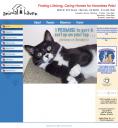
Old Animal Haven homepage A friend of mine connected me with the staff at Animal Haven a few months ago. At the time, they had a website that was hard to maintain, difficult to navigate and not focused on their goal: adoptions. After talking with the staff and learning where they wanted to take the organization and the website, I was able to design a site that better addressed their audience and their mission.

The homepage was revamped to prominently feature adoptions; random photos of their adoptable pets (courtesy of PetFinder.com) are immediately visible, and visitors can view all of Animal Haven’s adoptable pets without leaving the site. I integrated tools they were already using, like Google Calendar for events and Google Checkout for donations. Thanks to the new content management system, they can easily manage the site and incorporate content from YouTube and PhotoBucket. Last but not least, I added a blog to help them share their success stories, shelter news, event information and more.

I’m really happy with the results; special thanks to the staff at Animal Haven for all of their input and effort. If you’re in the Kansas City area and you’d like to adopt a pet, AnimalHavenKC.org is the place to go.

Results:
Since launching the site two weeks ago, overall visits have increased 38.5%. Pageviews have increased 180%. The bounce rate has dropped over 72% — from 66% to 18%, the average time spent on the site has increased 144%, and blog subscriptions have been increasing every day.

TripAdvisor redesigns (beta)

TripAdvisor, the travel site that has never let me down, has cracked the lid on their new site — see it here. Overall, it’s a huge improvement — the effort and planning involved are evident in the information design and user experience. It’s much easier on the eyes thanks to the wider layout, increased whitespace, rounded corners and more. Congrats to the design team, whoever you are.