Prognosticators 20.0

Back to the future Delorean on the road
photo credit

Pew / Internet just released their latest installment of “The Future of the Internet” where they ask various people what the Internet will be like 20 years from now. I think the fact that this is only Pew’s 3rd installment in the series speaks volumes.

Think about where the internet was 20 years ago — heck — 10 years ago and you can see it’s daunting to even attempt and imagine what anything will be like 20 years from now. I’d be tempted to guess jetpacks for everyone (solar-powerered, natch), food in pill form and (tastefully) metallic clothing. That, or a zombie-infested, post-apocalyptic dust bowl with ragged clothing.

With a quick scan through the responses to a question about the future mobile technology, I’d peg a lot of the predictions becoming reality in the next 2 – 5 years (if they’re not already here now. For example, “Voice recognition and touch user-interfaces with the internet will be more prevalent and accepted by 2020.” Somebody should get these folks an iPhone.

Another example; “The divisions between personal time and work time and between physical and virtual reality will be further erased for everyone who is connected, and the results will be mixed in their impact on basic social relations” — I think that’s in my job description.

On a semi-related note, Kevin Kelly has a great talk on the next 6,500 days of the web. His position—which I agree with—is the web of the future will be radically different that what we know and love today.

Hat tip to Advertising Lab

All Kinds of Awesome

Here’s some of the stuff that’s caught my eye recently that may be worth your time, too:

The Price is Right (Isn’t It?) Why shouldn’t made-for-web productions should have budget as big as their televised counterparts? This article aims to lay the groundwork putting a fair price on your digital blood, sweat and tears.

Springwise – This is a recent addition to the Review category in my RSS feed. Basically, it’s a steady stream of new business ideas—some new interesting, some stuff that’s been in the market for a while. Kind of a Trend Hunter with a business focus. Worth a look.

dev.mobi recently relaunched as mobiForge. I hadn’t really spent a lot of time exploring this site before the refresh; there’s a ton of content available. They have resources for developers, designers, marketers and more. It looks like a great resource for anyone who’s involved in the mobile space.

And if your mindset is more design thinking/trend hunting/cool data, mobiForge has a sister site, mobiThinking. The content’s not as deep as the main site, but it’s worth an add to the ‘ol feedreader.

Wecome to the social (media) revolt – the gist: by its very nature, the web is in a constant state of change and its always been about making connections, so why is social media seen as a new, groundbreaking idea?

I have to agree with Joshua’s angle; the fundamentals haven’t changed, but the tools we all use to connect/socialize/etc. are getting easier and easier for non-geeks to use, which allows more people to participate and brings the “social” bit of social media to the fore.

A simple idea that provided hours of entertainment this summer is popping up again: John McCain Is Your Jalopy and Sarah Palin Is Your New Bicycle’s Flat Tire. I think the web will be a little less entertaining once the elections are over.

Noteworthy, early June edition

The nicer-than-the-name suggests folks over at the barbarian group are giving away a web browser called plainview — it’s tailor-made for presentations; just enter a URL (or a set) and you’ll see nothing but fullscreen browsing goodness. No browser chrome, distracting bookmark bar, tabs or other distractions. Did I mention it’s free?


(i)Phone as human to digital interface.
— a (relatively) old-y but goodie from the gang at Zeus Jones posing the idea that connected devices like the iPhone a well positioned to become true extensions of yourself — with the ability to document virtually everywhere you travel and everything you see, hear and do.

Last but not least, a classic video from Charles and Ray Eames. I was explaining this video to someone recently — if you’ve never seen it, it’s worth your time to watch the whole thing.

The Producer of the Future

Creativity Online has posted a nice video tour of CP+B’s Boulder office. Normally, I would have posted this as a link dump kind of post, but the first half of the video is interesting enough to warrant a post of its own.

The folks at CP+B are talking integrated producers — meaning they pair specialists in web, video and interactive on projects. As they work together, those specialists push projects to new places with the added benefit of learning new skills along the way. As they begin to see projects from different perspectives, you end up with a video producer who could excel at creating (or overseeing the creation of) a website, web pros shooting videos for online spots, etc.

This kind of idea has been knocking around in my head for the past year or so, but this video does a great job of putting the disparate ideas in my head down on pixels. I think this approach is a natural evolution of online media and those who create it.

Watch it ASAP — I think Creativity locks their content behind a subscription page after 7 days or so.

AnimalHavenKC.org redesign

Redesigned Animal Haven homepageI am happy to announce the recent launch of a new website for Animal Haven, a fantastic Kansas City-area animal shelter. Animal Haven’s mission is to provide a higher quality of life for homeless pets through adoption, education and collaboration with the animal welfare community. They’ve been around since 1968, working hard to place homeless pets in good homes.

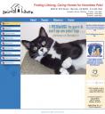
Old Animal Haven homepage A friend of mine connected me with the staff at Animal Haven a few months ago. At the time, they had a website that was hard to maintain, difficult to navigate and not focused on their goal: adoptions. After talking with the staff and learning where they wanted to take the organization and the website, I was able to design a site that better addressed their audience and their mission.

The homepage was revamped to prominently feature adoptions; random photos of their adoptable pets (courtesy of PetFinder.com) are immediately visible, and visitors can view all of Animal Haven’s adoptable pets without leaving the site. I integrated tools they were already using, like Google Calendar for events and Google Checkout for donations. Thanks to the new content management system, they can easily manage the site and incorporate content from YouTube and PhotoBucket. Last but not least, I added a blog to help them share their success stories, shelter news, event information and more.

I’m really happy with the results; special thanks to the staff at Animal Haven for all of their input and effort. If you’re in the Kansas City area and you’d like to adopt a pet, AnimalHavenKC.org is the place to go.

Results:
Since launching the site two weeks ago, overall visits have increased 38.5%. Pageviews have increased 180%. The bounce rate has dropped over 72% — from 66% to 18%, the average time spent on the site has increased 144%, and blog subscriptions have been increasing every day.