Burger King – Fresh?

Burger King and Mess Marketing recently opened an Art Gallery/Event Space/Think Tank/Hipster artist collective in Chicago dubbed Burger King Studio. The concept is kind of interesting; you can mingle with artists at the occasional event and buy and customize t-shirts on the site. All-in-all, a great fit for BK’s well-known “have it your way” brand position, but there are some pieces of this campaign that have drawn a little too much inspiration from the creative community they’re aping.

Figure 1 – Inspiration?
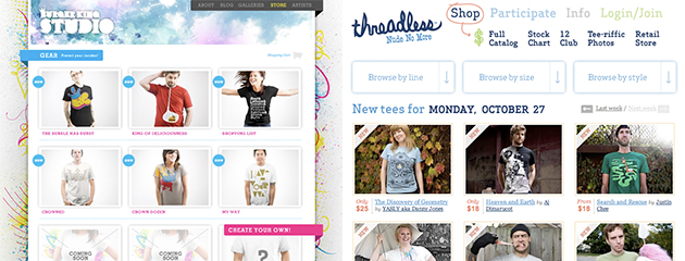
This is a shot Burger King Studio’s Store side-by-side with Threadless.com — note the similarities in the presentation of the t-shirts, the use of hipster models and solicitations to participate/create your own shirts. Despite the similarities, I could give BK a pass on this one as more of an “inspired by” than a rip-off.

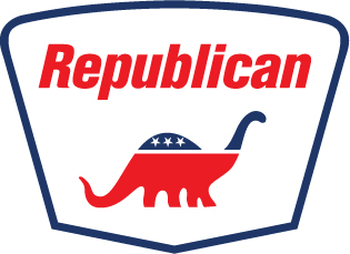
Figure 2 – Rrrrrrrip
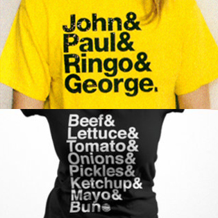
Unlike the Figure 1, this example is a 100% rip-off of a classic design created by Experimental Jetset. In fact, this design has been ripped so many times that Experimental Jetset has a section of their site dedicated to cataloging the infractions.

Not only is the t-shirt unoriginal, it kind of made me think of the old McDonalds Big Mac jingle. You know, the one where they sing the ingredients…

Figure 3 – mixed messages

The jingle is about 15 seconds in…


What do you think? Should they get an “A” for going through the effort of trying something new in a well-trod space or is this simply another clumsy corporate co-opting of creative culture?

Fennec – the little things

I downloaded a copy of Fennec today — Mozilla’s experimental mobile browser optimized for touch screen mobile devices.

If you’re either TK or one of the .00001% of the rest of the population who owns a Nokia N810, you can test the browser in a real mobile environment.

For the rest of us, Mozilla’s been kind enough to offer downloads of Fennec that work in Windows, OS X and Linux.

It’s actually pretty aggravating to use a touch screen-optimized browser with a mouse and keyboard, but I was happy to see the thought they’ve put into the user experience.

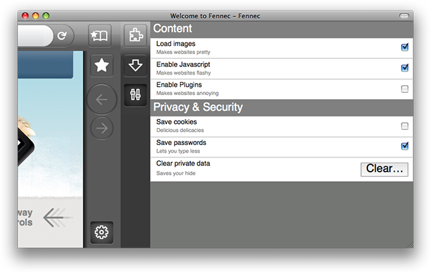
Case in point, the settings screen:

If you can’t read these, the items include gems like:
Load images – Makes websites pretty
Enable Javascript – Makes websites flashy
Enable Plugins – Makes websites annoying

At SXSWi ’08, there was a great panel called, “From Frustration to Elation” that made the case that injecting emotions (like humor, happiness, empathy, etc.) into products, software and services helps people make positive connections with the experience, which can contribute to the difference between a successful product and a failure.

In an arena with a growing number of players (like this, this and this), little things can have a big impact.

Joe the Plumber?

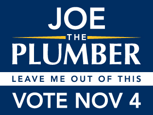
Continuing the recent thread of politically-themed design posts, I’ve created a campaign sign for Joe the Plumber, a new d-list celebrity introduced to the public by John McCain in the 3rd and final Presidential debate.

As with another recent post, I’m releasing this design with a Creative Commons license, so that anyone can grab the artwork and use it for any non-commercial endeavor (or at least come up with a cleverer slogan).

Vector (.ai), large jpeg

Creative Commons License
Licensed under a Creative Commons Attribution-Noncommercial-No Derivative Works 3.0 United States License.

For my fellow font nerds, the Obama-like font is Avenir, as I don’t have a copy of Gotham handy.

2 Campaigns, 2 Approaches to Microtargeting

I’ve run across a couple of nice examples of microtargeting on behalf of the McCain and Obama campaigns; it’s interesting to see the contrast in the use of technology here.*

Obama’s campaign is running ads in Burnout Paradise on XBOX 360. Fittingly hi-tech, these ads appeal to younger, connected voters; encouraging them to vote early. (via)

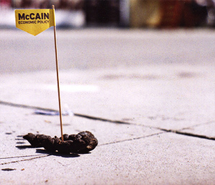
The McCain campaign is taking microtargeting literally with this more grass roots/lo-fi approach, This example touts McCain’s economic policy — presumably suggesting it’s “the sh**”*. (via)

*please note the saracasm

All Kinds of Awesome

Here’s some of the stuff that’s caught my eye recently that may be worth your time, too:

The Price is Right (Isn’t It?) Why shouldn’t made-for-web productions should have budget as big as their televised counterparts? This article aims to lay the groundwork putting a fair price on your digital blood, sweat and tears.

Springwise – This is a recent addition to the Review category in my RSS feed. Basically, it’s a steady stream of new business ideas—some new interesting, some stuff that’s been in the market for a while. Kind of a Trend Hunter with a business focus. Worth a look.

dev.mobi recently relaunched as mobiForge. I hadn’t really spent a lot of time exploring this site before the refresh; there’s a ton of content available. They have resources for developers, designers, marketers and more. It looks like a great resource for anyone who’s involved in the mobile space.

And if your mindset is more design thinking/trend hunting/cool data, mobiForge has a sister site, mobiThinking. The content’s not as deep as the main site, but it’s worth an add to the ‘ol feedreader.

Wecome to the social (media) revolt – the gist: by its very nature, the web is in a constant state of change and its always been about making connections, so why is social media seen as a new, groundbreaking idea?

I have to agree with Joshua’s angle; the fundamentals haven’t changed, but the tools we all use to connect/socialize/etc. are getting easier and easier for non-geeks to use, which allows more people to participate and brings the “social” bit of social media to the fore.

A simple idea that provided hours of entertainment this summer is popping up again: John McCain Is Your Jalopy and Sarah Palin Is Your New Bicycle’s Flat Tire. I think the web will be a little less entertaining once the elections are over.

Hindsight’s 20/20

By now, everybody’s heard about (and commented extensively on) Microsoft’s $300 million campaign to rebrand Windows as a indispensable tool for a billions-strong community of like-minded individualists living a life without walls. The good people at CP+B have set the interwebs abuzz with criticism and praise for the campaign. Time will tell whether that buzz equals a successful campaign, but if history is any guide, the answer may be staring us in the face.

Fire up your flux capacitor and look back at the June 2008 issue of Fast Company—the issue with a smirking Alex Bogusky gracing the cover. By the time this issue hit the newsstands, many in the ad world had already heard about CP+B’s relationship with Microsoft and all the talk centered around what the campaign would look like. As it turns out, the answer lay in the opening spread of the feature article, pictured here:

That headline again? “Believe it or not, he’s a PC.” Theme theme of the recently-launched campaign? “I’m a PC.”

If only we’d know then what we known now…